
Soft and Muted Florals

Although I really love bold and cheerful colours I am also drawn to subtle and muted tones, especially in vintage tapestries such as the one above.
This beautiful fabric is Victorian...

...and this pretty Barbola wall plaque is decorated with wonderful softly painted anemones.

Perhaps we're getting a little bolder now, although the colours in this old chalkware plaque are quite gentle.

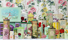
I have selected these pretty pieces for my shop - but I couldn't help it - I've just had to include something bright and cheerful!

What do you prefer; bold and bright or soft and subtle?


Those are all so pretty!
ReplyDeleteI like soft, muted colors myself. Things that are faded ~ aaaaah....
:)
I like both brights and muteds... one week I'll sew handbags in bright summery fabrics and the next week I'll work with faded florals. They're both beautiful!
ReplyDeleteI think it depends on which season I'm in, for instance if it's winter I like soft muted cosy colours but summer is for bright colours!
ReplyDeleteI like both it depends on my mood.
ReplyDeleteI love all the pieces that you have shown us but my favourite is the vintage tapestry.
ReplyDeleteI'm a bit of a pastel girl!
Alison x
I'm afraid I like it all! Especially when you photograph it! My house is quite muted but our last one was very bright, now and again the need for brightness takes over!
ReplyDeleteKim x
Soft muted chalky tones for me.
ReplyDeleteLove all the new items - off to take a peek!
Tracy x
Clare you have a lovely blog, I've bookmarked it so I can visit often. Beautiful items.
ReplyDeleteHi Clare,
ReplyDeleteI LOVE both!!!
Bright florals are so cheerful - perfect for the kitchen and dining room.
Faded florals are restful and soothing - perfect in the bedroom and living room.
Although I think anything goes!!.... Or even a mixture of the two!....I'll stop now, I'm waffling!!
I'm looking forward to receiving the curtains from you - Lovely bright florals!
Niki x
Hi Clare! I posted off your writing paper yesterday, I hope it gets to you safely! I personally love soft and subtle rather, your fabrics you choose are really pretty.
ReplyDeleteI say, yes thank you to them all! I am a little bit schizophrenic about colours and style really. One day i like blue, then red, then pink. And then i like traditional, then vintage, then French country. I mix and math with everything really. But one thing is certain, i love the countystyle and colours!
ReplyDeletehi clare,i love the soft muted pastel look,i love the way fabric fades with time,my mother in law had a huge barbola mirror but no-one seems to know where it went! best wishes ann.
ReplyDeleteI just happened to traipse through your lovely little blog for the first time today...and I love it here.
ReplyDeleteRight now I am on a color kick...but I think it must have to do with the spring, turning to summer warmth, everything shouts sunny and bright! But I do have a deep appriciation as well for the finer, more muted tones...
I'm a soft and muted gal myself! Beautiful items in this post.
ReplyDeleteCherry Menlove xx
Such pretties!
ReplyDeleteHi, this is my first time here. Lisa at Pink Paint & Roses said I would enjoy your blog and she's so right! You have a lovely blog!
ReplyDeleteI usually like soft, faded colors. Although, all those pieces are pretty!
Manuela
I love all shades, tints and tones of color, but as my furniture and trim in my house is dark, I do prefer to decorate with muted colors. My house is too tiny for so much "dark" color. Your tapestry is GORGEOUS!
ReplyDeleteHi,
ReplyDeleteI came upon your blog through others and I enjoy reading it. I hope you don't mind that I'm booking marking it to visit more often:-). You have wonderful items.
Have a great day!
I've been lurking for a little bit, but thought it was high time to leave you a comment. Especially on something I love so much. :) Isn't color wonderful? My home is all pastels and light colors. Kind of like spring and Easter. Bright colors are fun and look good in most other peoples homes, but red and orange rarely pass through our door. :) Though they are fun to wear! Thank you for sharing. It's such fun to see inside others homes.
ReplyDeleteOh I can never decide! Both are gorgeous!
ReplyDeleteHi Clare I like the faded look, I particularly like that bird fabric. I seem to be going through a bird phase at the moment!
ReplyDeletebest wishes Ginny
I love both, although I am drawn to the muted colours.
ReplyDeleteMarie x
They are all so lovely. Its hard to choose. I do think the tapestry is my favorite.
ReplyDeleteClare,
ReplyDeleteyikes, I always see everything I LOVE on here...every thing you have is so pretty!
Hope you are doing well, and enjoying your great garden.
Lidy
frenchgardenhouse
Hi thanks for your comment on my Blog,Think you thought i was in the U.S but i am in Australia.We have mothers day today same as the U.S I prefer subtle but love all of them things.Actually its time worn i love.I do prefer brighter in summer but.
ReplyDeleteJullie
Definately Bold and Bright every time ! - love Julia x
ReplyDeleteGorgeous photos!!! I love soft and subtle in the bedrooms, and the bathrooms, but bold and brights in the kitchen and the dining and living rooms!!!
ReplyDeleteSoft and washed out, almost no color...yeah baby!!!
ReplyDeleteI love the old faded stuff, but have to have some of the brights too. So I keep my main rooms tranquil and have shots of brightness in the breezway, library, and guest bath. That way I get the best of both.
ReplyDeleteI can't decide whether I'm a bold and bright or soft and subtle. I think it depends on my mood. I do have a lot of bright reds and blues in my home, but I'm starting to feel more and more attracted to more subtle colours lately.
ReplyDeleteHi Clare :) Just popped by to wish you a great week and i am shure you have a lot to do as always :) So how`s the weather in England? Here it is very windy and rainy, but i enjoy it anyway :) Today a went to the local market and bought some beautiful fish, salmon!
ReplyDeleteOh, i LOVE salmon, and fish in general :) I am going to bake it in the oven en make some sweet and sour carrots and then with a lovely mustard sauce to go with it, and of course some potatos. I am shure my friend will be pleased with this lovely surprise :)
Well, i am looking to hear from you again and take care, greeatings from Aina
It's all very beautiful
ReplyDeleteHmm, soft or muted? Maybe neither.
ReplyDeleteThe shabby pastel look that's been so popular for the past few years is beautiful. I have one bedroom in our get-away house done in that style.
I usually go in for staturated colors with quite a bit of contrast. For instance my kitchen is painted white but the counters are white tile with decorative cobalt blue and black designs. My living room is cream but with navy and wine (and oriental carpet on hardwood).
I think the architecture of the home itself often dictates the decorating style don't you?
Darla
I adore that fabric. I love the muted colors these days.
ReplyDeleteHi Clare! Lulu finally let me get back on the computer. Just making the rounds making sure she didn't do any damage to anyone's blog.
ReplyDeleteIs yours OK? No scratches or rips?
Lovely pictures with all those flowers!
ReplyDeleteMonika
Wow, those are pretty! BTW, you are one of maybe 3 people I've met in my whole life who spells her name the way I do. And get this...my husband's name is Mike! However, we only have 2 cats (plus a dog and 2 ferrets!)
ReplyDeleteSoft and subtle here...actually faded is fine!!! I even like most colors a little grayed...except RED...my favorite and used often!!!
ReplyDeleteYour blog is beautiful....thanks for sharing!
Well said.
ReplyDelete